 English
 中文简体
中文简体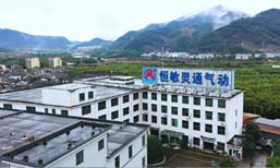
LLOGO Design
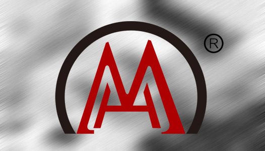
The logo consists of the pinyin letters of the company name "HENGMIN". The semicircle surrounds the letters, shaped like a rising sun full of vigor and hope, symbolizing the lofty goals of the enterprise. The logo is shaped like a flower/rising sun/opening peacock, with red as the main color. This color represents positive elements such as enthusiasm, vitality, warmth, joy, etc., which symbolizes the diversified development direction of the enterprise and and the spirit of continuous innovation and aggressiveness.
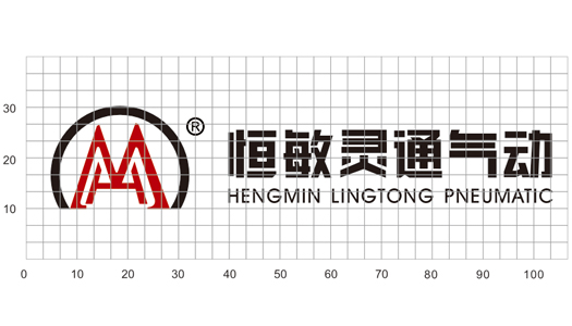
Combination of Logo and Chinese & English
In order to unify the consistency of corporate messaging. The combination of corporate logos and Chinese, English and other elements, is one of the most important visual elements of corporate CI, including location and distance, are specified in detail to establish basic design elements, the consistency and standardization of combination formation and reserved space. In order to highlight the identity of the corporate logo, all design elements are kept to the specified reserved specifications.
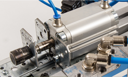
Since 1996, Ningbo Hengmin Lingtong Pneumatic Complete Set Co.,Ltd (LTPC) has manufactured pneumatic products for a wide range of industries.


Copyright @ 2021 Ningbo Hengmin Lingtong Pneumatics Components & Set Co., Ltd.
